
Discrete Research – Smarter Investment
Mathematical Research Pty Ltd ABN 43 619 287 991
www.mathematicalresearchgroup.com
Smarter Investment is one of our proprietary programs within the Discrete Research product series. It targets at utilising advanced statistics and machine learning to manage risks in financial industry.
One man’s risk is another man’s return. This philosophy drives the whole process of developing Smarter Investment, which assists your investment decision making based on your own appetite of risk and return.
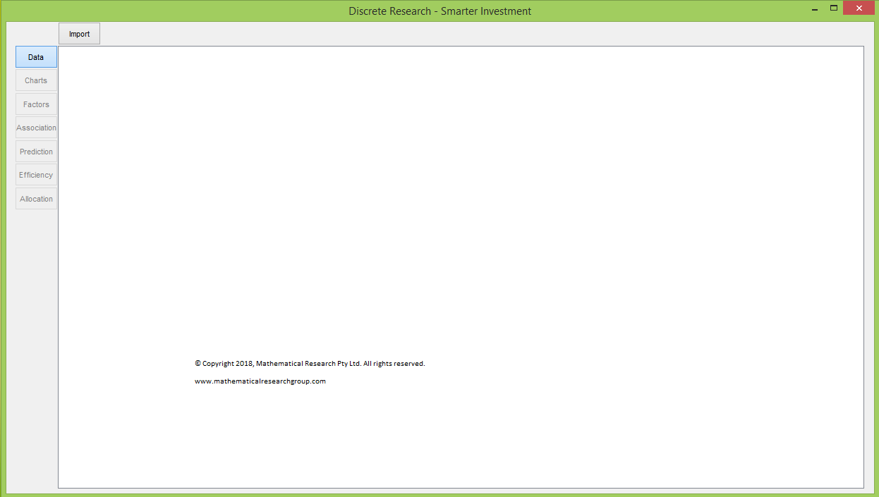
Smarter Investment contains seven toggles on the left-hand side, naming, Data, Charts, Factors, Association, Prediction, Efficiency and Allocation. Each toggle brings you to a section with state of the art functions and information.
In the beginning, only Data section is active with Import button on the top of the data table area.
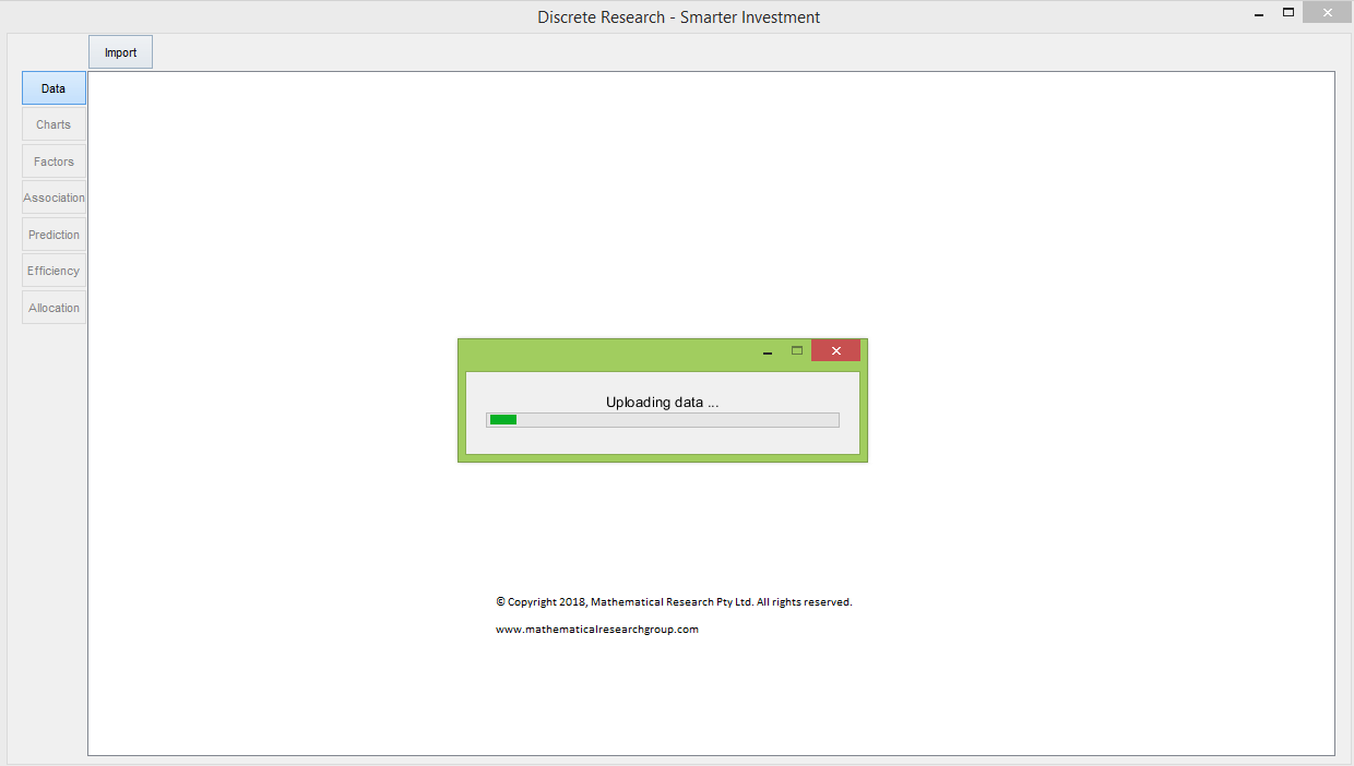
By clicking the Import button in the Data section, you are about to uploading return data with asset names. You will be directed to select the spreadsheet with your data. Smarter Investment will then automatically check the validity your data. You are suggested to upload more than 200 rows and more rows than five times of the number of columns.
Smarter Investment automatically calculates initial parameters after uploading data successfully. This may take several minutes depending on the size of your input data as well as demanded accuracy of the prediction.
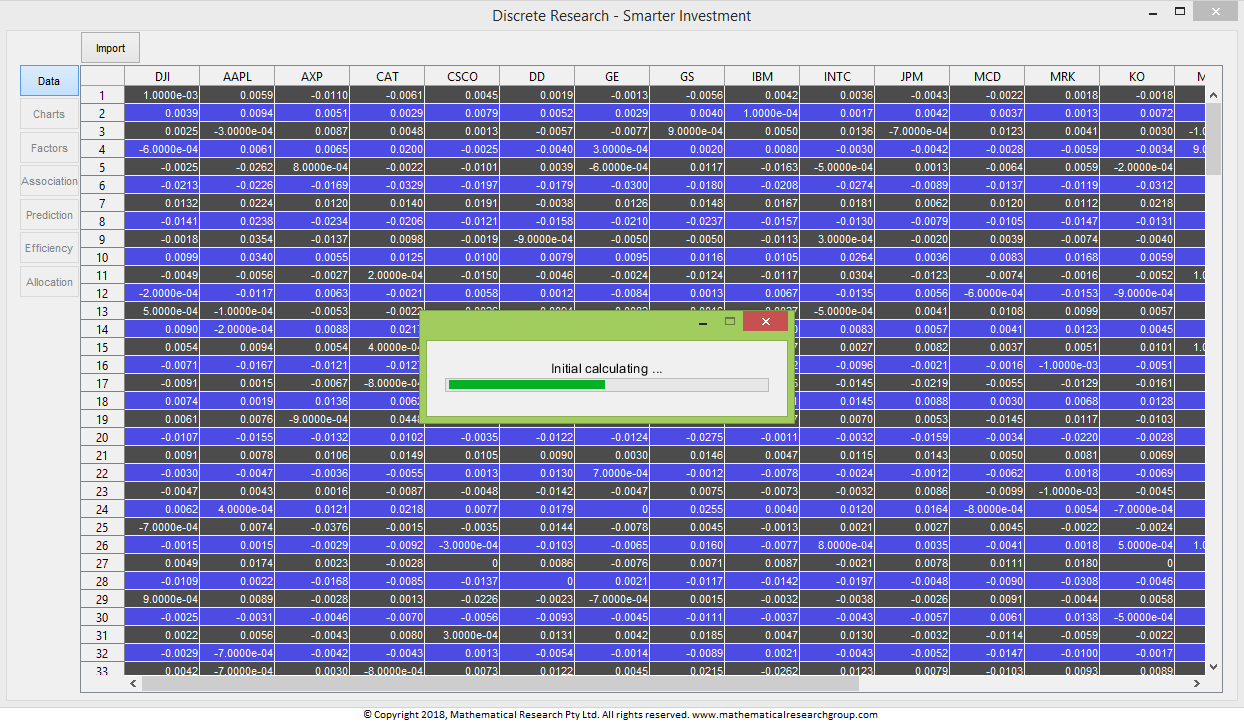
After validation and initial calculation, you can review your data in the data table. You are suggested to double check the data table and your original data.
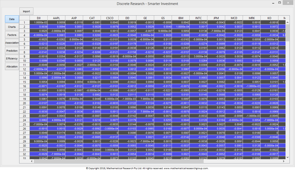
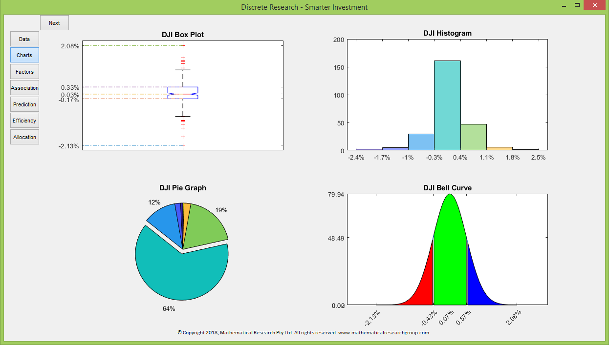
If the uploaded data are valid, then all toggles will be activated. You are now able to access the statistical analysis for the first column of your data in the Charts section.
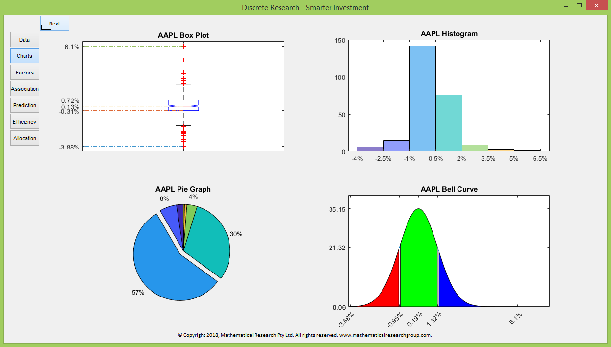
The box chart shows the minimum, 25th percentile, medium, 75th percentile as well as the maximum value of the data in your first column.
The histogram tells the number of observations of your first column data in each of the seven data slots. The data slots start from the minimum value and end at the maximum value. They are consecutive and have the same length.
The pie chart depicts the portion of the number of observations in each slot. The pie chart and the histogram are correspondent in the sense that the same colour represents the same data slot.
The bell curve is based on the mean and standard deviation of the first column data. In the situation that the first column data are normally distributed, the shape of the histogram will be close to the bell curve.
You can access the statistical analysis for all columns of the uploaded data by clicking the Next button at the top left of the charts.
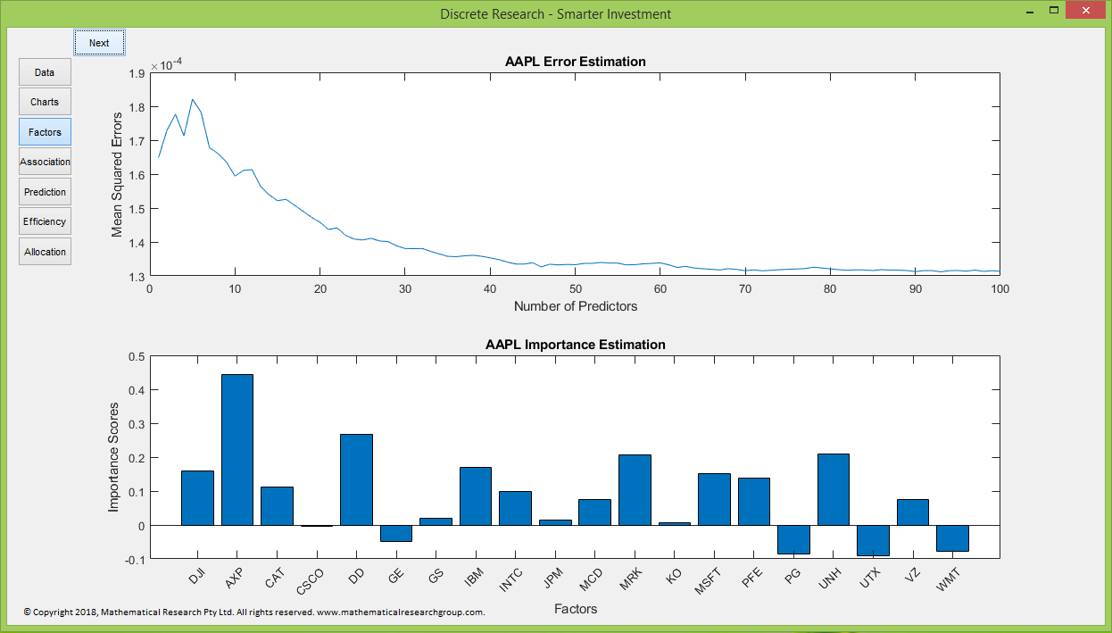
The Factors section provides two pieces of important information. The line chart depicts the mean squared error against the number of predictors. The importance estimation tells the importance of each asset in predicting the asset return in the first column.
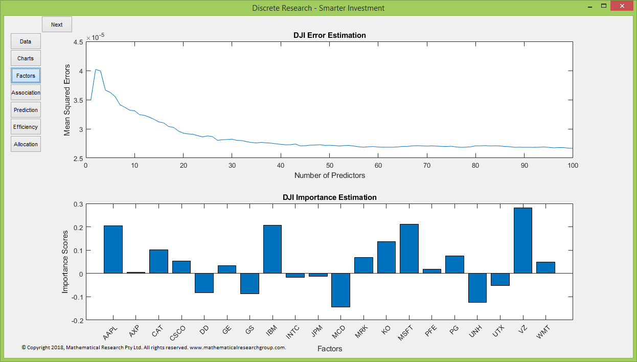
To access to the factor analysis for data in other columns, please click the Next button at the top left of the charts.
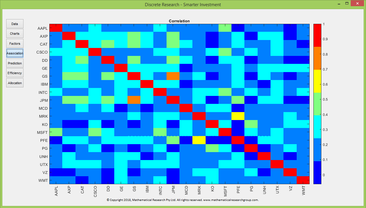
The Association section depicts the correlation between all pairs of assets. High correlation not only indicates high risk but also casts negative effects on the predictions.
Smarter Investment uses machine learning technology to predict future returns and hence future risks.
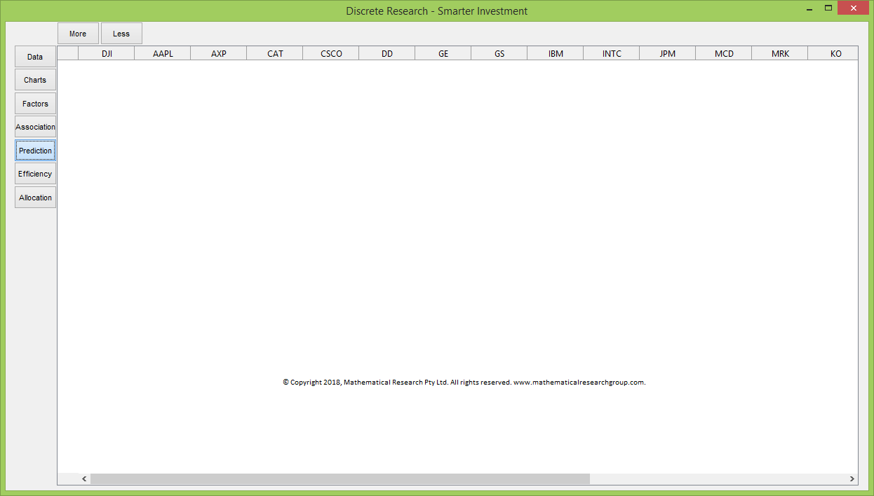
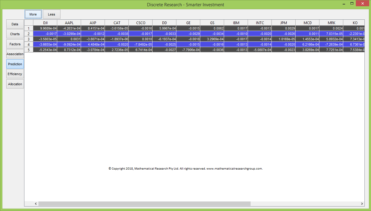
You can obtain predicted returns by clicking the More button at the top left of the data table.
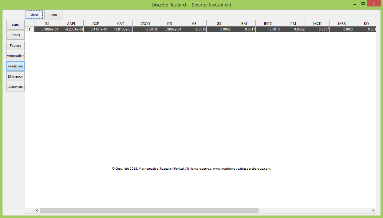
It is possible to modify the predicted data based on your own views of the market.
If you have modified the data, then when you click the More button again, the new predicted returns will be based on your modified data.
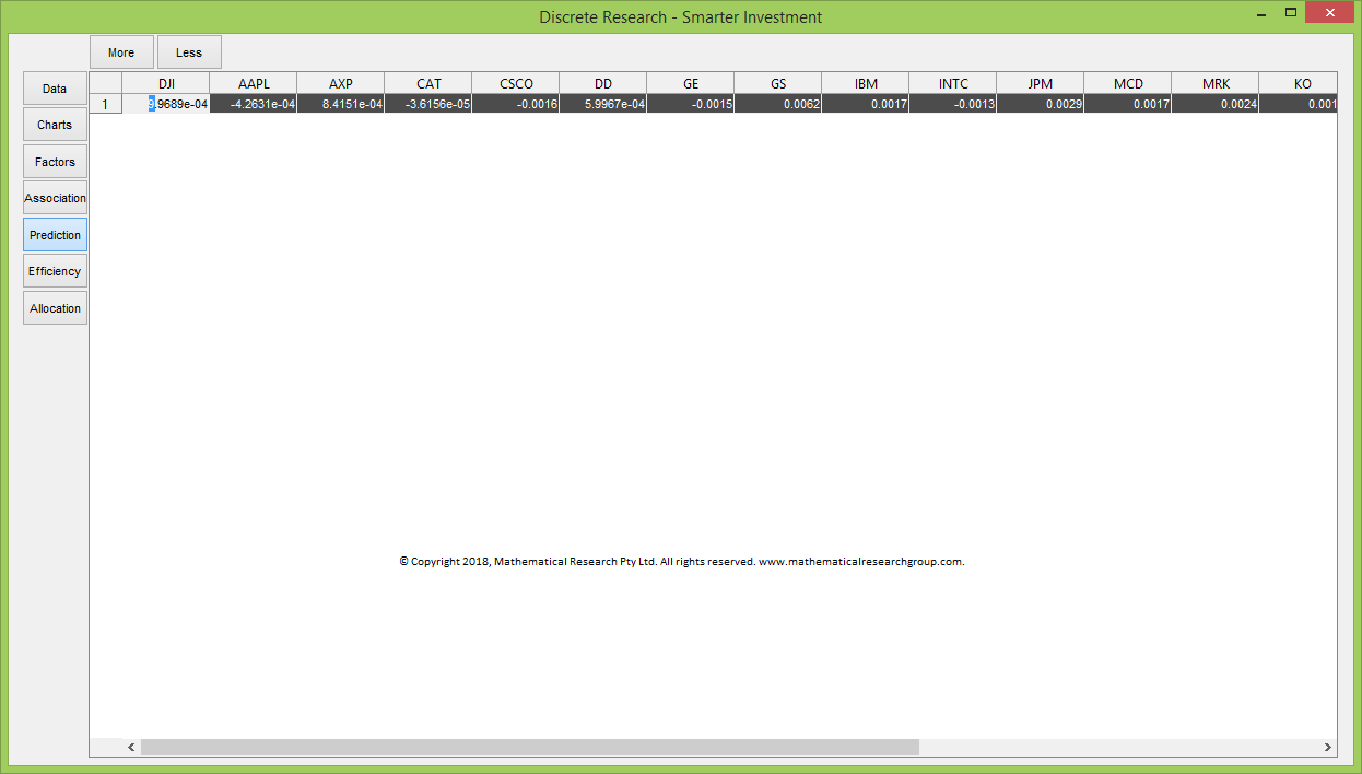
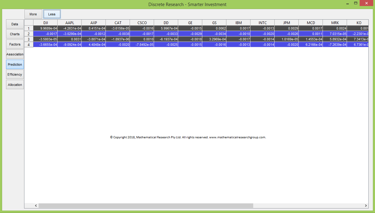
You can delete the latest prediction by pushing the Less button.
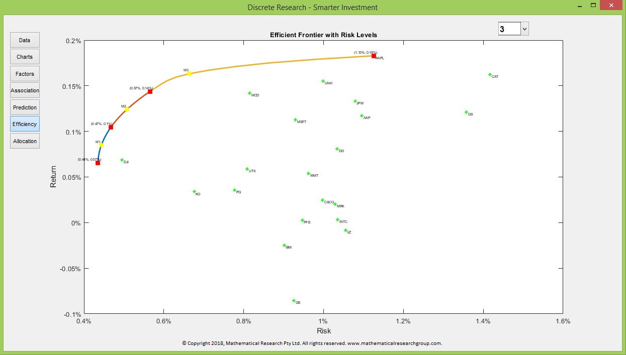
The Efficiency section depicts the long only efficient frontier based on your uploaded data as well as your predicted data if there is any.
For a given risk, the corresponding return on the efficient frontier is the maximum return one can expect by allocating investments in a long only portfolio with the historical and predicted returns. Conversely, for a given return, the corresponding risk on the efficient frontier is the minimum risk one can expect by allocating investments in a long only portfolio with the historical and predicted returns.
The yellow star on the efficient frontier represents the efficient portfolio with return that is the mean of the maximum and minimum returns of all efficient portfolios.
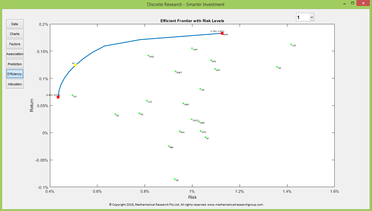
You can select the number of risk levels on the efficient frontier from the drop-down list at the top right of the chart. Each risk level is emphasised by a certain colour on the efficient frontier. The red squares represent the end points of risk levels. The risk and return of each red square can be read from the nearby coordinate.
Each yellow star on the efficient frontier represents the efficient portfolio whose return is the mean of the returns of the end points of its risk level.
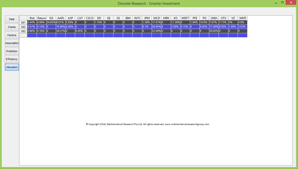
The Allocation section lists the allocations of efficient portfolios represented by the yellow stars.
All the numbers, texts, charts, and opinions generated from Smarter Investment are based on the data receiving from you. Past performance is not a reliable indicator of future performance.